Leadership
 Culture
 Customer Experience
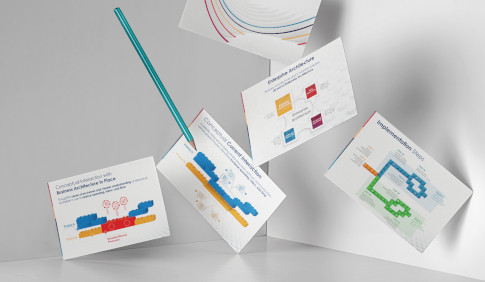
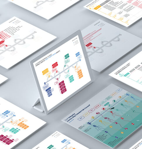
 Strategy
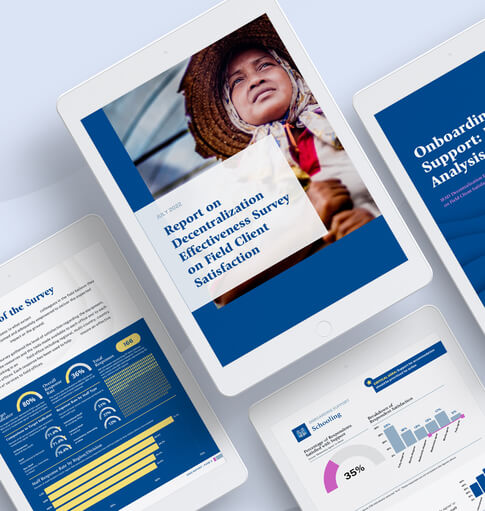
In late 2023, I wrote about the importance of visuals in providing context to data. To delve further into the visual portrayal of data, you can revisit that article. Nevertheless, the fundamental idea remains: raw data can be daunting and difficult to interpret. Just think about how difficult it can be to gain insight from a spreadsheet. Through visuals, we can effectively democratize data by presenting it in intuitive, easy-to-understand formats that people across functions can use to make better decisions.
At the end of that piece, I covered an example of how we bring data to life using visuals through dashboards. Today, we’ll go one click deeper and discuss how The Clearing approaches dashboard design and the considerations we prioritize when creating them.

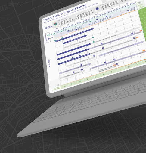
The Keys to Dashboard Design Success
The Clearing’s visuals team, data team, and consultants work collaboratively when creating dashboards for our clients. This is particularly important as each team has a critical role to play in the process.
- Our consultants ensure we as the visual team understand our client’s needs and goals, then work with us to identify available data sources;
- Our data team analyzes our client’s needs and goals, identifies information gaps, and synthesizes the intel into insights that will enable decision-makers to make more informed choices; and
- Our visual consulting team blends the client’s needs, data, and insights to produce an easily digestible dashboard that efficiently and effectively conveys critical information.
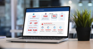
As we work through this process, we focus on three key areas to ensure each dashboard is an effective decision-making tool.
- Accuracy. When I create dashboards, I use data directly from the source and have regular check-ins with the people who provide the data inputs to ensure accuracy. More and more, data systems are automated, which helps reduce workload (i.e., data entry) and decrease the risk of human error. This means the data I am pulling into the dashboard isn’t always entered by a human. However, these systems still require human insight to set up and monitor. Check-ins are often conducted via project management tools and help me mitigate errors and ensure I am not somehow inputting my own bias into the tool as I create visual representations of the data insights. The project management tools also make it easier for our stakeholder groups – consultants, data team, and clients – to engage in the dashboard creation process by not forcing them to jump from platform to platform when I need additional information or clarification.
- Reliability. In addition to ensuring our data is accurate, we also ensure we can reliably receive it. Even the most insightful dashboard is not very useful if decision-makers can’t trust it will be available consistently. The best way to ensure reliability is the same as the best way to ensure accuracy: automation. However, that’s not always possible. So, we work with our clients and data team to create systems that are intuitive and easy to use, making it less of a chore to pull the data we need to create insightful dashboards.
- Relevance & Usability. Finally, even accurate and reliable data isn’t helpful if it’s not relevant. That’s why I work closely with our consulting team and clients to ensure that what comes through in their dashboard is what matters to them and their stakeholders – ultimately helping them make better decisions and more effectively serve their customers.
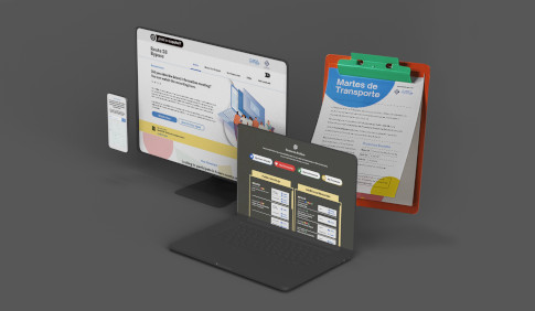
We also strive to make each dashboard usable in ways that matter for specific clients. For example, one client at a large government agency receives regular real-time requests for data reporting. To meet their needs, we developed a dashboard that lives in Google Slides with key data displayed visually slide-by-slide. These slides are directly linked to the data source and update automatically based on predefined formulas. This approach to usability – and a unique use case – has been a game changer for our clients. They can now produce a polished, insightful dashboard at a moment’s notice to meet stakeholder needs.
Developing Your Dashboards
If your organization is struggling to make sense of its data or could be more effectively using it to make smarter decisions, The Clearing can help. Our holistic approach to data and insights, combined with our people-first approach to problem-solving and visual consulting know-how, enables us to develop the data solutions that are best for you and your stakeholders. Reach out anytime to learn more.

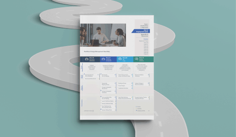
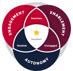 The Clearing’s Employee Experience
Improvement model, adapted from Itam
& Ghosh, 2020, focuses on three objectives:
The Clearing’s Employee Experience
Improvement model, adapted from Itam
& Ghosh, 2020, focuses on three objectives: