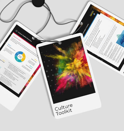
As avid followers of our thought leadership content are aware, we regularly utilize this platform to spotlight the tangible achievements of our consultants. However, it may come as a surprise to learn that we also specialize in crafting customized training programs and professional development initiatives for our clients. Whether we’re optimizing data strategies or designing training modules, our approach is firmly grounded in human-centered design (HCD) principles and a strong focus on usability.
Recently, customer experience consultant Kinsley Gerks and visual consultant Melissa Stites collaborated to develop a customer experience (CX) training for one of The Clearing’s federal government clients. Below, Kinsley and Melissa share how they integrated HCD methodologies and usability best practices to deliver a learning experience that not only aligned with the client’s leadership objectives but also resonated with a diverse array of participants.
Human-Centered Design & Usability
Our colleague Jody Barto recently wrote about the unique needs of adult learners. While she didn’t explicitly use the terms human-centered design or usability, she drove home a key point in support of both: training should first and foremost be designed with the needs of the audience in mind. Jody focused in on adult learners; however, what is the one thing ALL learners have in common? They’re people.
That simple fact is why HCD and usability are so important when developing learning programs. Before we dive into how we used these principles to develop a new CX training, let’s recap both terms.
Human-centered design considers the human perspective during all phases of problem-solving. That could mean thinking about what live data a leader needs when designing a new metrics-based dashboard, to putting people and their needs first when designing a new workplace environment.
Usability goes hand in hand with accessibility and refers to the ease with which users can interact with a product – in this case, professional development training – to efficiently and effectively achieve their goals. When we consider usability, we focus on simplicity. Though we’re designing visually aesthetic products, functionality comes first.
The bottom line for both concepts is that you must have empathy for your audience, meaning putting people first and placing yourself in their shoes to understand their perspectives. In design, you consider this and put it at the forefront of all stages of development. When you hold your audience top of mind, whatever you are designing has a much better chance of being enjoyable and successful.
Putting HCD & Usability into Practice
This customer experience training Melissa and Kinsley developed consists of four modules, beginning with an organizational overview before moving to specific customer experience skills. With such broad material, we started by gathering information from a variety of stakeholders. This included working with the agency’s directorates and offices to secure explanations of their services for the organizational overview – including a live edit session for leaders to help us ensure their part of the organization was being described clearly – to liaising with information technology to maximize capabilities on iCompass, the software platform on which the training would live.
These two areas are a great microcosm to explain how human-centered design and usability came into play.
Human-Centered Design
From an HCD perspective, working directly with the directorates to gather and then evaluate the information and content with the end-user in mind ensured the material would be both informative and easily digested. This was critical because the training would be mandatory for the entire agency workforce, meaning the audience is a very wide range of people – from folks on their first day at work to people who have worked in government for 30 years.
Let’s look at acronyms and the multimedia element of the training as two use cases in action. Specifically for the acronyms, while the seasoned federal employees would be familiar with the countless acronyms in use at the agency, the new hires could easily be confused. As such, we refined the content around both sets of users, ensuring the training was understandable while not being too elementary. That included simple steps like spelling out any acronym before it is used as an acronym. Additionally, the multimedia aspect of the training allows users across the agency to learn based on their personal preference – via audio explanations, visually with pictures and videos, and written words on the screen and the paired transcript. These little upgrades helped ensure the content did not feel pedantic while keeping it clear for all audiences.
Usability
The deep dive into iCompass capabilities was critical for usability, allowing us to design a training fit for the platform instead of trying to fit a square peg into a round hole. Doing so ensured a training that ran smoothly and efficiently. As we all know, nothing is more frustrating from a usability perspective than trying to complete a task only to be confronted with a glitchy technical experience.
Following these steps, we continued to refine the training experience. First, we ran a full tech test to make sure the product was functioning correctly within the iCompass system. From there, we ran a pilot with several employees across the organization to evaluate usability. Leveraging their feedback, we made final revisions to the content and experience before the training went live. To ensure continual improvement, the training includes an optional user survey to gather continual usability and informational feedback, allowing us to iterate and enhance the experience over time.
The End Result
By putting the end-users at the center of the training design process, we created a product that meets learning objectives, works smoothly with required technology, and takes into account the needs of a wide variety of learners.
If your organization is faced with a similar challenge, be it training for the entire agency or a small group, keep the principles of human-centered design and usability front and center – you and your organization will be better for it. And if you need help doing it, our team of training, development, and design experts is always ready to discuss. Reach out anytime, we look forward to hearing from you.




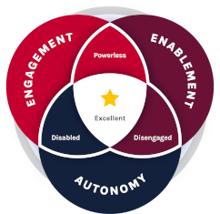 The Clearing’s Employee Experience
Improvement model, adapted from Itam
& Ghosh, 2020, focuses on three objectives: