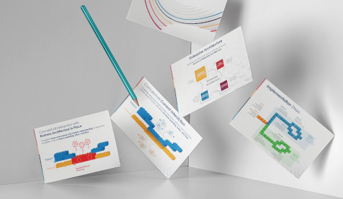
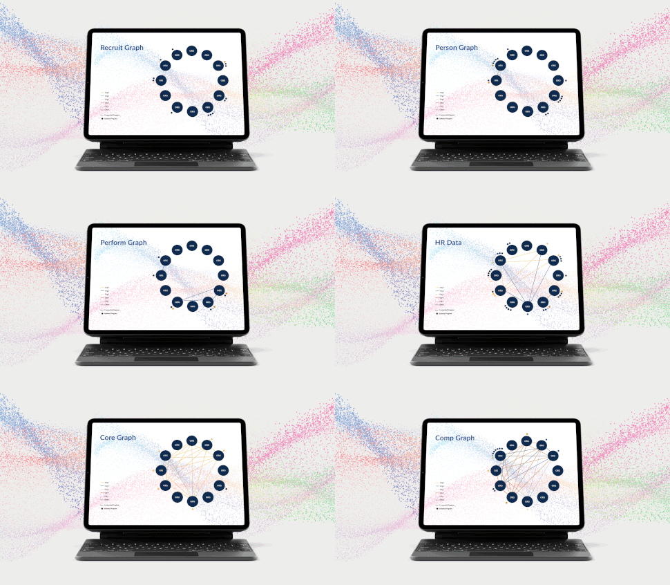
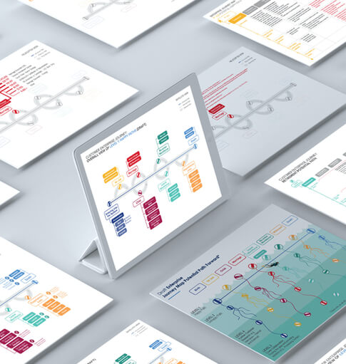
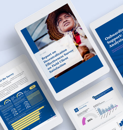
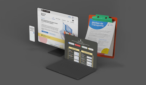
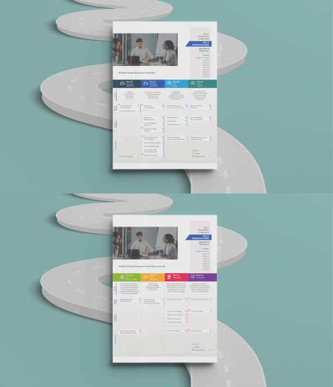
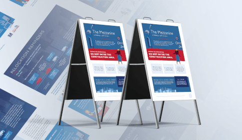
Visuals are some of the most powerful communication tools we possess in our organizations, and they’re only becoming more important and impactful in today’s digital age. Because design is so ubiquitous, many leaders make the mistake of assuming that it’s also easy. Good visuals that clearly communicate a complex topic in a concise way take hours and hours to assemble. To help you cut down on some of that time, this week we’re discussing three tips for employing effective visuals in your organization.
Start with Guidelines. They Tell You Who You Are.
One of the worst things you can tell a designer is “do whatever you want.” Often when working in design, clients and leaders are afraid to provide direction regarding their visual identity or how they want the information conveyed. In effect, they ask the designer to guess at what they want, which can be a recipe for dissatisfaction (not to mention endless hours of revisions!).
Strong organizations establish visual identity guidelines that indicate exactly how they should present information so as to best communicate their values. Fonts, colors, and styling all communicate an array of non-verbal cues: is your organization buttoned-up, or fancy-free? Are you cutting-edge or classic? Establishing these guidelines up front will give your visuals a good starting point.
Complexity Begs for Design.
Whenever you’re presenting a complex concept, use a visual. Doing so makes it more digestible to your audience. But to get there, remember that you’ll need to put in a lot of work. If you’re telling a story, you might need to use storyboarding to understand exactly how you want things to progress. If you’re struggling with a complex process, sketch it out first to save time. And don’t be afraid of iteration and feedback. Your goal is to simplify the complex, and the best way to gauge if you’ve done that is to get feedback along the way.
Keep It Clean.
Remember that your goal is to clearly communicate information as quickly as possible. The more bells and whistles you add to your design, the more you’ll be distracting the person whom you’re trying to reach from the message you’re trying to convey. So keep your design very light and minimal, and remember to edit yourself so that the story, not the design, comes to the fore.
The Clearing’s communication experts and graphic designers have extensive experience in reducing complicated, technical narratives into simple, easy-to-digest, visual products that can be integrated across communication mediums. Contact us to learn more about our graphic design and strategic communications services for corporations, government agencies, and non-profits.



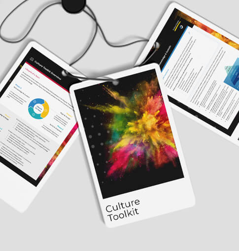

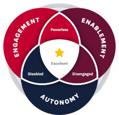 The Clearing’s Employee Experience
Improvement model, adapted from Itam
& Ghosh, 2020, focuses on three objectives: