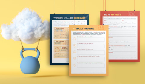
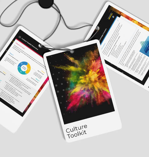
When it comes to visual design, federal government clients present unique challenges. TC visual consultant Melissa Stites has become an expert at navigating them, producing visuals that differentiate both the materials she produces and The Clearing.
Why Designing for Federal Agencies is Anything but Dull
Before joining The Clearing, I worked at a graphic design agency where my primary focus was on healthcare clients. At TC, the majority of my work is designing for federal agencies. From the outside, that may seem dull – the government doesn’t maintain the most cutting-edge reputation; however, it’s actually the opposite.
Thanks to The Clearing’s breadth of federal clients, my job is essentially working for a portfolio of brands. And just like brands, some agencies are more modern; some are to the point and simple. So, while the agency personalities differ, our mission at The Clearing remains the same: create beautiful products for people.
Another surprise for many is when I tell them that the more creatively conservative agencies are actually the most enjoyable to work on. Because a lot of the work is focused more on function over design, it’s allowed me to grow my skills in areas like data visualization, where the challenge is making something tell a clear story while also looking great.
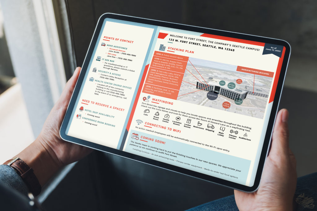
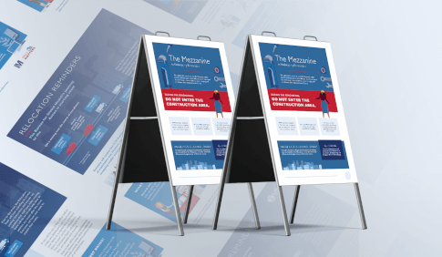
Example of an agency’s wayfinding sign for employees and guests – a combination of style and function.
The Clearing’s Design Differentiators
I’m proud to report that The Clearing has become known amongst clients for its visual design acumen. When I began at The Clearing, I was impressed that everyone – including our visual consulting team – came from such diverse backgrounds. That’s what gives us such diverse perspectives and makes differentiating on visuals possible. The focus we put on visuals throughout The Clearing’s work is something you don’t see very often in the federal space. That differentiation in visuals is something our clients have both come to expect from us and come to us for support.
Here’s how to think about it. As my colleague Robyn Klem previously wrote, we often find the common denominator amongst our clients is a lack of shared language. It is difficult to solve problems and see opportunities when two parties don’t understand what the other is saying. We’ve found that building a visual language bridges that gap, helping improve communication and enabling the creation of more meaningful solutions.
Another area we differentiate on is accessibility. In fact, my colleague Daniela Aburto recently wrote an article about it. Along with healthcare, few industries put as much focus on accessible design as the federal government. As such, our team of visual consultants work to understand the different and changing ways that people need assistance to use the materials that we produce. From ensuring that all colors are 508 compliant (which is readability if you are colorblind) to optimizing font size, we view every project through an accessibility lens.

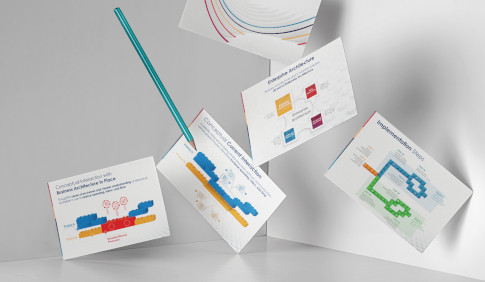
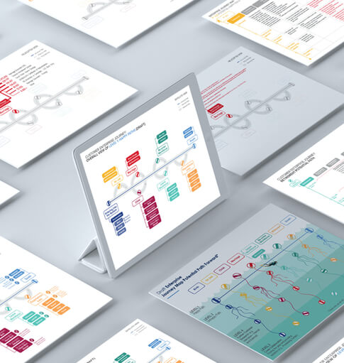
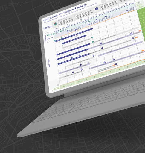
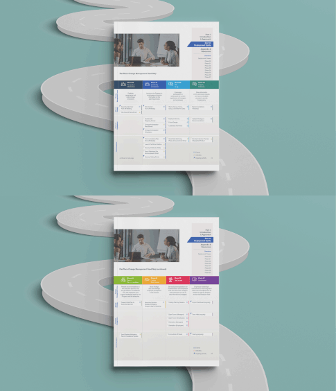
Example of a Visual Roadmap
Putting Principles into Practice
We put those design differentiators into practice every day. Piggybacking on accessibility, here’s an example from earlier in my TC career. I worked on a large design project for a federal IT program rollout. Because it had the potential to impact workers across almost any agency, the communication materials we produced to educate people on the program had to be entirely accessible.
In addition to items like colors discussed above, the creative had to be compatible with the screen-reading technology of the day. That meant we had to make a beautiful product that could also be read left to right, top to bottom by a screen reader – no easy task when incorporating visuals, multi-step lists, and paragraphs on a single page. It also meant images had to be labeled and described with metadata that would allow visually impaired or persons with low vision to understand the materials’ purpose.
All in all, it was a perfect example of federal government accessibility consideration and illustrated the challenge of incorporating form AND function that makes designing for federal agencies fun. It also showed me how a designer can make an impact while keeping things clean and simple.
If you’re looking to take your communications to the next level or facing an accessibility challenge with legacy materials, our visual consultants can help. Contact me at melissa.stites@theclearing.com – I would love to hear what’s on your mind.

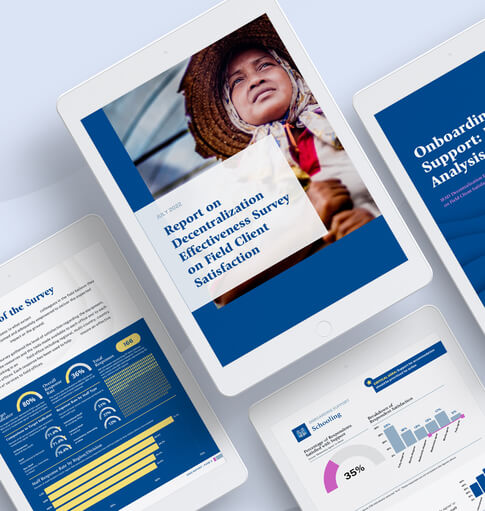



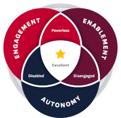 The Clearing’s Employee Experience
Improvement model, adapted from Itam
& Ghosh, 2020, focuses on three objectives: